 Photisan
Black and white from the light: how Photisan does it
Photisan doesn't take the color out of a finished photo: it computes the gray from the scene's light, through an emulsion and a filter, then prints it on paper, places it in zones and tones it. How it works, and how to get your best black and white out of it.
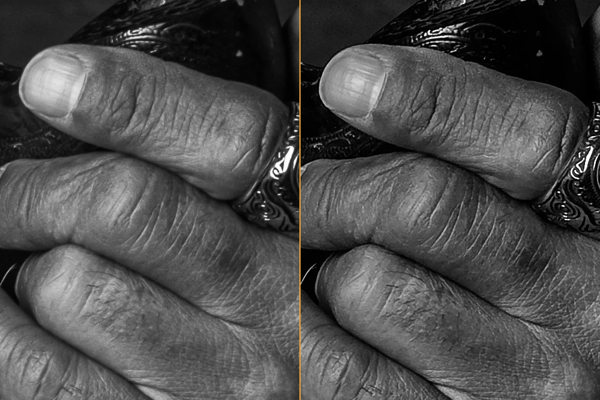
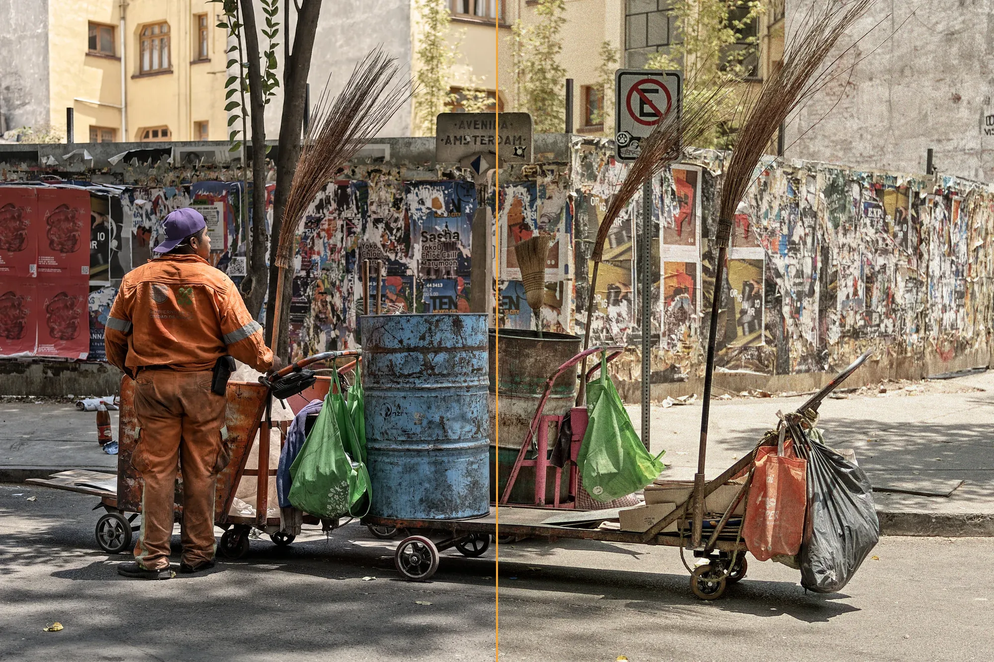
The usual way to make black and white in a photo program is to develop the image in color and then take the color away, sometimes with a channel mixer to decide how light each one comes out. The gray comes from a finished photo, with its tone curve, its white balance and its saturation on top. In Photisan black and white is a treatment of the development, next to color, and the gray is computed from the light of the scene, the way a film exposed through a filter did it.
Why starting from the light matters
With film, the gray of each thing depended on two things: the light coming from the scene and what the emulsion was able to see, with whatever filter was in front of the lens. Then came the paper, the printing and, maybe, the toning. Photisan follows the same order. What you did to the color of a photo doesn't leak into the gray, because the gray doesn't come from that color photo.
One consequence shows as soon as you pick Black & white under Treatment: white balance disappears. It didn't exist with film either; the color of the light was corrected or used by the filter. Another one doesn't show, but you'll appreciate it: mixing channels pixel by pixel with a strong filter turns color noise into gray grain, and a smooth sky under a red filter can come out dirty. Photisan darkens that sky without dirtying it, and a border between two colors of the same brightness still separates them in the gray.
The response: what the film sees
The first emulsions only saw blue. Then came orthochromatic ones, which saw green but were still blind to red, and in the early twentieth century panchromatic ones, sensitive to the whole visible spectrum. Each draws the world differently, and in Photisan you choose which one you want under Response:
- Panchromatic, that of a modern fine-grain film: it sees every color, blue strongly, so without a filter skies come out light.
- Orthochromatic, blind to red: lips, freckles and red flowers come out dark, and skies light. It's the look of old portraits.
- Eye: each color's lightness as we perceive it.
- Digital sensor: the light as a sensor without its color filters would record it, the mean of 52 measured cameras.
- Films: the ten black and white films of the simulation, from Tri-X to Acros, each with its measured sensitivity.
The filter in front of the lens
Photisan's filters are the classic Wratten ones: yellow 8, orange 21, red 25, green 11 and blue 47. Each is computed from its transmission curve and the sensitivity of the chosen response, and its exposure is compensated, as the photographer did by opening up. Yellow darkens the sky a little and gives the most natural tones; orange makes dramatic skies and lightens skin; red leaves the sky almost black; green lightens foliage and darkens skin; blue does the opposite of red and brings out haze. Density doses it, and an orthochromatic response with a red filter can't be chosen, because it would see nothing.
The mixer, for what the filter can't reach
The Mixer lightens or darkens each family of colors in the gray, along a curve that goes around the color wheel and takes free points to fine-tune a particular hue. Grays never move. Reach decides which colors it gets to: one way, only intense ones; the other, soft and muted ones too. And Protect skin keeps skin at the gray of the response without a filter, so a strong filter neither darkens nor bleaches it; it also looks after similar colors, such as wood or sand.
The paper: grade and split grade
The print's contrast is the Grade of a multigrade paper, from 00, the softest, to 5, the hardest, with 2 as normal; middle gray doesn't change. With Split grade the paper gets two exposures, as in the darkroom: one through the softest filter, which sets the highlights, and one through the hardest, which sets the shadows. Turning it on leaves the print almost the same, and from there each control moves its end.
The Zone System, in the print
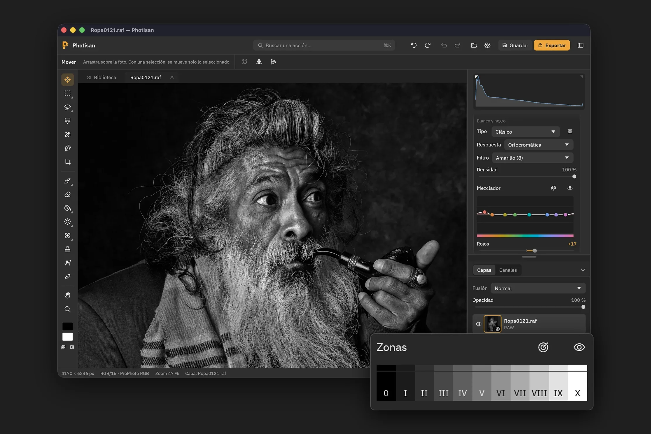
Around 1940, Ansel Adams and Fred Archer laid out the gray scale in eleven zones, from pure black (0) to paper white (X), with middle gray at V. In Photisan the zones are the print's, and each one can be dragged up to lighten it or down to darken it, never past its neighbors, so the order of the tones is kept and no jumps appear.
Two tools make it practical. The zone map paints the print in its eleven grays by areas, not grain by grain, the way the system reads a scene: the face in one zone, the coat in another. And on the photo, the pointer works like a spot meter: it tells you the zone and lightness of what's under it, and if you drag on a place, you move its zone.
Toning: chemistry, not a tint
A toner turns the print's silver into another substance with a color of its own: the brown sulfide of sepia, the purplish selenide of selenium, gold's blue-black. That's why, on a truly toned print, the color depends on how much silver there was: nothing in the paper white, pale in the highlights, stronger toward the shadows, and a hue that turns as it darkens. Photisan's toners (sepia, selenium, gold, sepia and selenium, and copper) behave that way, instead of tinting the highlights one color and the shadows another, and so do the tones of three old printing processes: platinum, palladium and cyanotype.
Each one starts where it starts in the chemistry: sepia in the highlights, selenium in the shadows and the rest across the whole print. Progress says how far it has gone and Intensity, how much. Separately, Paper tone goes from a cold white to a warm, cream one, and shows where there is little silver.
And the negative
A black and white photo can be exported as a monochrome DNG: its gray before the tones, which any raw developer opens like a file from a monochrome camera. The paper, the zones and the toning are done when it's developed, and Photisan opens it again with those of the original photo. If you want to keep the color version too, Duplicate in Black & White leaves you both in the document.
Tips for your best black and white
- Start with the Type. Next to the selector you get thumbnails of your photo with each one. Pick the one closest to what you have in mind and adjust from there: each type is a response, a filter, a mix and a contrast, all still editable.
- Choose the filter by looking at the sky and the skin. With sky and clouds, try orange or red. In a portrait, yellow or a low-density orange, and if you go for a strong filter, turn on Protect skin.
- Mix on the photo. Instead of looking for a color's family, drag up or down on it: it's faster, and you see the effect where it matters to you.
- Set the scale with the paper before the zones. If the scene is flat, raise the grade; if it has a lot of contrast, lower it. When the highlights and the shadows want different things, switch to Split grade: the soft exposure so the highlights don't burn, the hard one for the depth of the blacks.
- Place what matters with the zone map. In the classic system, a shadow with texture goes in zone III, middle gray in V, lit skin between V and VII depending on each person's skin tone, and snow with texture in VII or VIII. If something important falls out of place, drag it on the photo.
- Look after the ends. Raising zone 0 a little gives muted blacks, like a matte print; lowering X holds back whites that were burning. Zones II and III decide whether the shadows have detail.
- Use filters locally. In black and white, each mask has its own Filter: to the right it warms the response toward the red filter's, to the left it cools it toward the blue's. A linear mask over the sky with its Filter to the right darkens just the sky, like a graduated filter.
- Tone with a light hand. A little selenium with low progress gives the blacks depth without the color showing; sepia with low progress only warms the highlights. And a warm paper suits almost any portrait.
What we keep to ourselves
How each response is computed, how the mixer spreads the gray without dirtying it and how the paper and toner curves are drawn are our recipe. The rest is the black and white photography it has always been: emulsions, filters, paper and chemistry, now on your RAW files.
If you don't have Photisan yet, download it and try it for free. Black and white is in the development of any RAW file: choose Black & white under Treatment.