 Photisan
What's behind Photisan's film simulations
Each of Photisan's 24 films is built from the data its manufacturer publishes. This is how it works inside, from the moment light enters the emulsion to the lab's print.
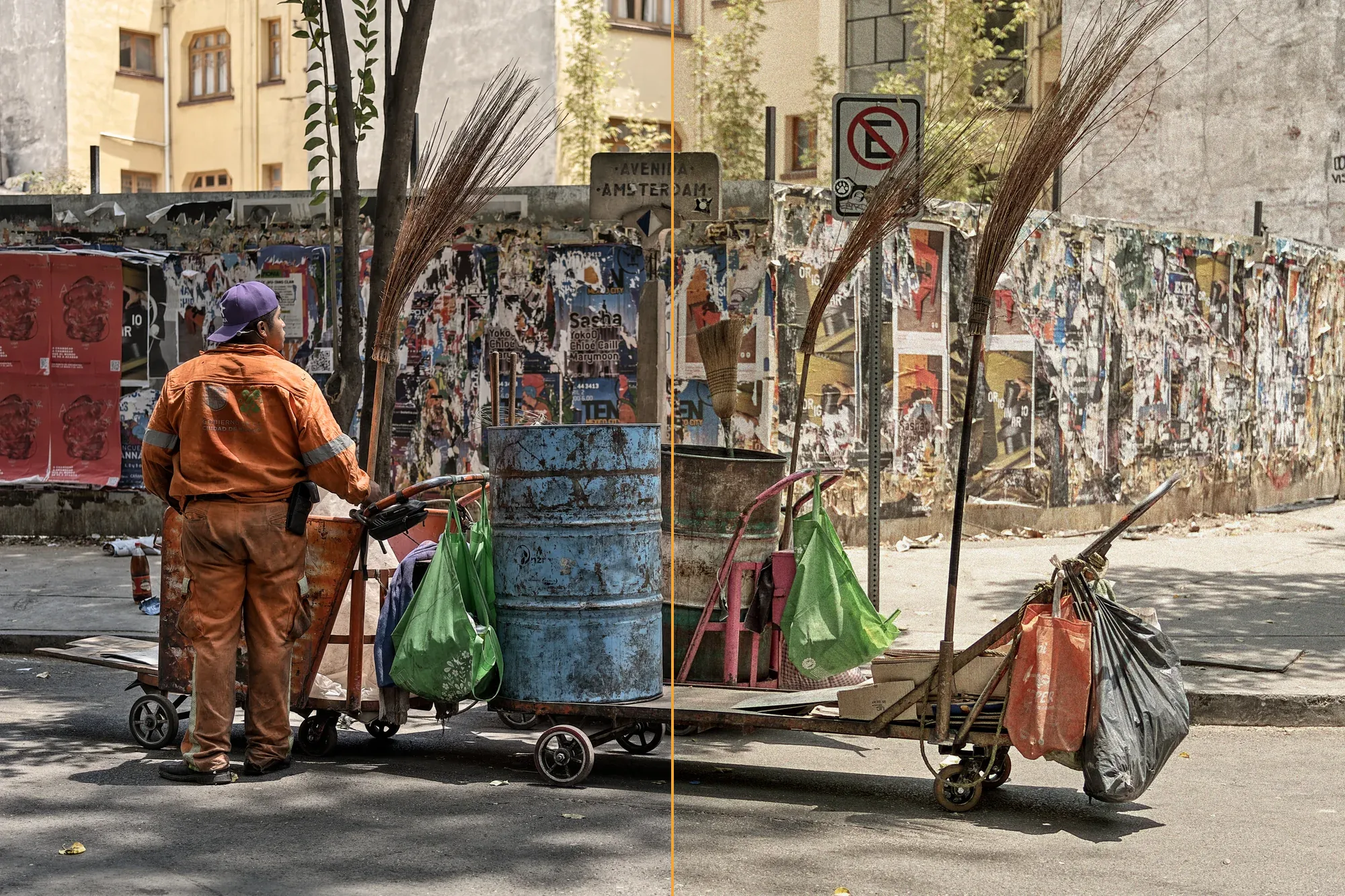
Most film simulations in photo apps are color tables. Someone shoots a color chart on film, scans it, and the app learns to turn each color in your photo into the color that came out of that scan. It works as long as your photo looks like the one the table was made from. When it doesn't, odd things happen: an overexposed sky turns flat gray, a tungsten lamp the table never saw comes out wrong, and the grain measures the same on a 12-megapixel photo as on a 60-megapixel one.
In Photisan we went another way. Each film is a small model of how that material works, built from what the manufacturer publishes in its datasheet: the characteristic curve of each layer, its sensitivity to each color of light, its granularity and its sharpness. Your photo goes through that model step by step, in the same order light would go through the real film.
The film sees the scene, not your photo
A film never saw a finished photo. It saw the light in front of the camera. So the first step is to undo what digital development did to the image, its tone curve and its way of rendering color, to get back to something very close to the light of the scene. What you changed while developing (exposure, contrast, white balance) stays, because it's part of the scene you want to photograph.
That way the film's curve and color act once, as they would in reality, and not on top of a curve and colors that were already there. The middle gray of your photo becomes the film's 18% gray at its rated speed: a Portra 400 exposed at 400.
How each film sees color
A color film has three layers, one sensitive to red, one to green and one to blue. Those sensitivities aren't three separate drawers: they overlap, and how much they overlap changes from film to film. Portra has wide layers that mix a lot, which softens colors and flatters skin. Velvia has a very narrow red layer, about 35 nanometers wide, and pulls colors apart much harder.
Photisan works out how each layer receives the light of your photo from the published sensitivity curves, under daylight or tungsten light, depending on which one the film is balanced for. That's why a Vision3 200T or a CineStill 800T used in daylight without an 85 filter turns blue, just as it does in the camera.
Black and white has a single layer, and there color filters make physical sense. Photisan's yellow, orange, red and green filters are the Wratten 8, 21, 25 and 11, multiplied by each film's sensitivity. When the red filter darkens the sky on Tri-X, it's because it stops almost all of the sky's blue before it reaches the film.
The layers hold each other back
When color film is developed, each layer releases substances that slow down development in the others. It's called the interimage effect, and it's one of the reasons a film's colors separate the way they do. Photisan models it so grays stay gray, and that's where each film's saturation is decided. In Velvia, for example, red holds back green, which pushes oranges and yellows toward red. That's where the color of a Velvia sunset comes from.
The characteristic curve, or why negatives forgive so much
Each layer responds to light along its characteristic curve, the density-versus-exposure graph every datasheet includes. It has a toe in the shadows, a straight stretch and a shoulder in the highlights. On Portra 400 that straight stretch covers about ten stops; on a slide film like Velvia, about five. That difference explains most of what you learn in practice: a negative takes overexposure well and a slide doesn't forgive it.
The Film exposure control uses exactly that. If you overexpose a negative, the print doesn't come out lighter, because the lab prints every frame at its normal brightness. What changes is where the scene falls on the curve: clean shadows and soft highlights if you gave it more light, blocked, grainy shadows if you gave it less. A slide does get lighter or darker, and it burns out or blocks up early, like the real thing.
Sharpness, edges and halation
Light doesn't stay put inside the emulsion. It spreads a little and softens the finest detail, especially in the red layer, which sits at the bottom. Development pushes the other way: next to dense areas the developer gets used up and edges gain contrast. The sharpness (MTF) curves manufacturers publish show both, and each film's model is fitted to those curves.
Halation is light that goes through the film, bounces off the base and comes back to expose the red layer around a very bright light. Almost every film has an antihalation layer that prevents it, and on those you barely notice it. CineStill 800T has none, and that's where its well-known red glow comes from. In Photisan, halation only comes from nearly blown highlights and spreads outward: a large white area glows at its edge, not inside.
All of this is computed in micrometers, on the real size of the frame. That's why it looks the same in the preview and in the export, and why it changes when you pick 35 mm, 6×7 or 4×5.
Grain with a real size
Photisan's grain lives in the density of each layer, not on top of the photo like a layer of noise. So it grows where the film is denser and follows the tones of the image. Its amount comes from the granularity the manufacturer publishes, measured over a given area of film, scaled to the size of each pixel in your photo for the format you choose. A 24-megapixel photo and a 12-megapixel one show the same grain in the print, and a 6×7 frame has finer grain than a 35 mm one, as with film.
With Grain at 100% you see the film's measured grain. You can lower it or raise it, but that 100% is an honest starting point.
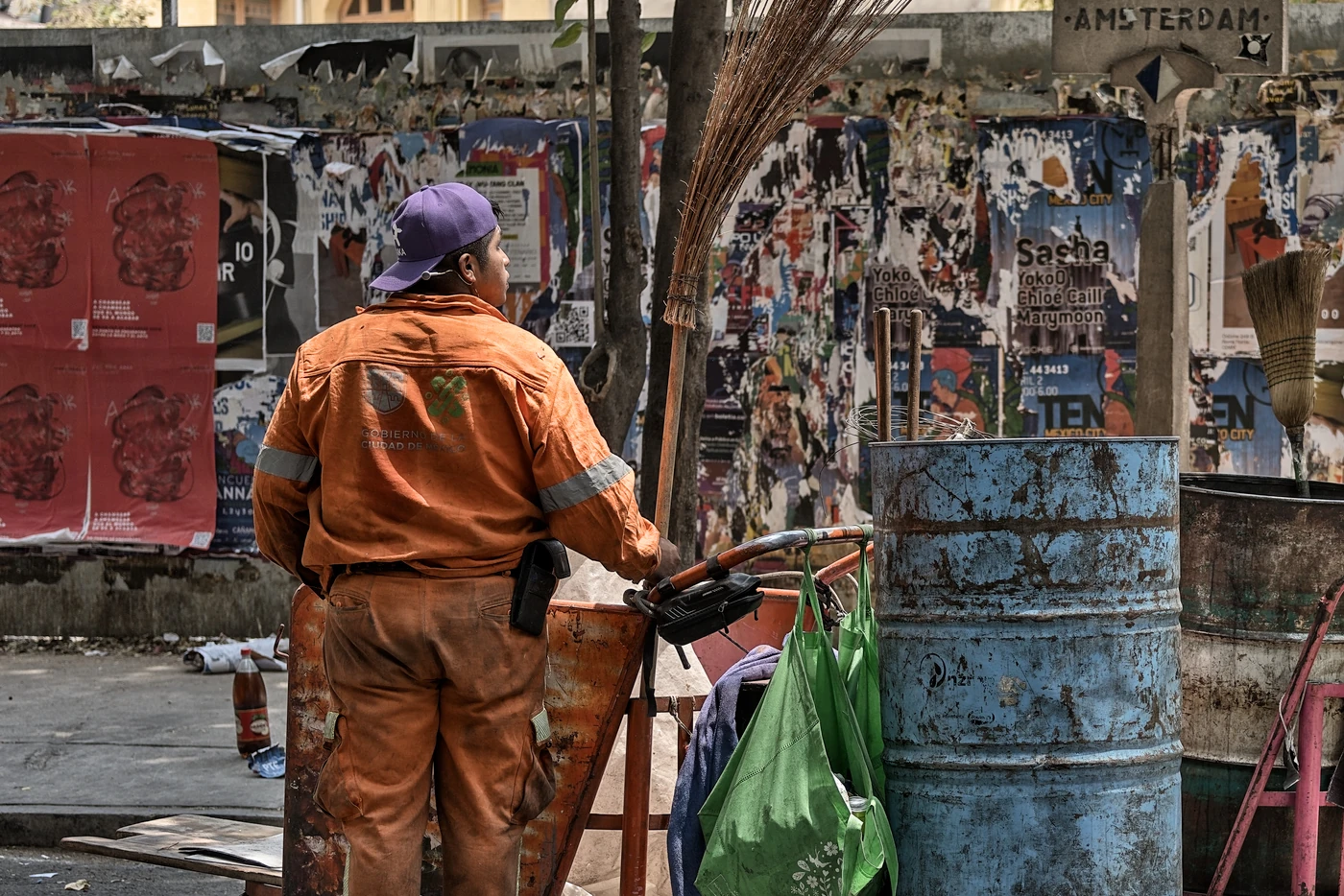
Without film, at 100%.
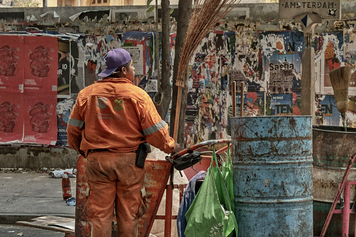
On Kodak Portra 800, at 100%: the grain follows the tones and the finest detail softens, as on a negative.
The lab
A slide is looked at directly: what you see is its dyes with light behind them. A negative needs someone to scan and print it, and that step changes the result a lot. Photisan does it the way a lab does: it balances the gray, prints on a paper curve and puts black and white where a well-printed frame would have them, with middle gray at 18%.
How we check it looks right
Every film was tested with a color chart and a gray scale: whether grays stay neutral (or keep Portra's slight warmth), how much each color saturates, where the highlights burn out and how many stops it takes for the shadows to go black. When a datasheet leaves a figure out, such as granularity, which Ilford doesn't publish, we estimate it from films of the same kind.
What we keep to ourselves
The exact numbers for each film and the way we fit them are our recipe, and that part stays in the house. The rest is no secret at all: it's photochemistry that has been documented in datasheets for decades, put to work on your photos.
Try it
The simulation lives in adjustment layers. Pick one of the 24 films and play with Film exposure, Grain, Format and Halation, and in black and white with Filter too. Since it's a layer, you can mask it or lower its Strength. If you don't have Photisan yet, download it and try it for free.