 Photisan
Color tells the story too: color grading in Photisan
Films choose their palette on purpose. Why color matters in today's photography, what color harmonies are, why Photisan brings a film colorist's tools and how to work with them.
In film, almost nobody leaves color the way the camera recorded it. Every movie has a palette chosen on purpose, from the production design and the costumes to the lighting and, at the end, the color suite. In French the craft is called étalonnage, which in film labs meant matching the shots so they all looked like part of the same movie; in English it was color timing, and today it's color grading. Besides matching, it now decides how each scene feels.
Photography inherited a different goal: correct color. Neutral whites, believable skin, saturation to taste. It's still a necessary base, but in today's photography, from portraits and fashion to documentary and personal projects, color is also a language. Some series you recognize by their palette before you know who made them.
Why color matters so much
Color arrives before content. Before you read a photo, you've already felt whether it's warm or cold, calm or restless. A warm tone draws you in and a cold one keeps you at a distance; a lot of saturation demands attention and a little lets the image breathe. And contrast between colors steers the eye: a subject in the color opposite to its background stands out without any extra light.
In a series, color also brings unity. Ten photos taken in different places and at different times become one body of work when they share a palette. At heart it's the same problem the lab's color timer used to solve.
Color harmonies
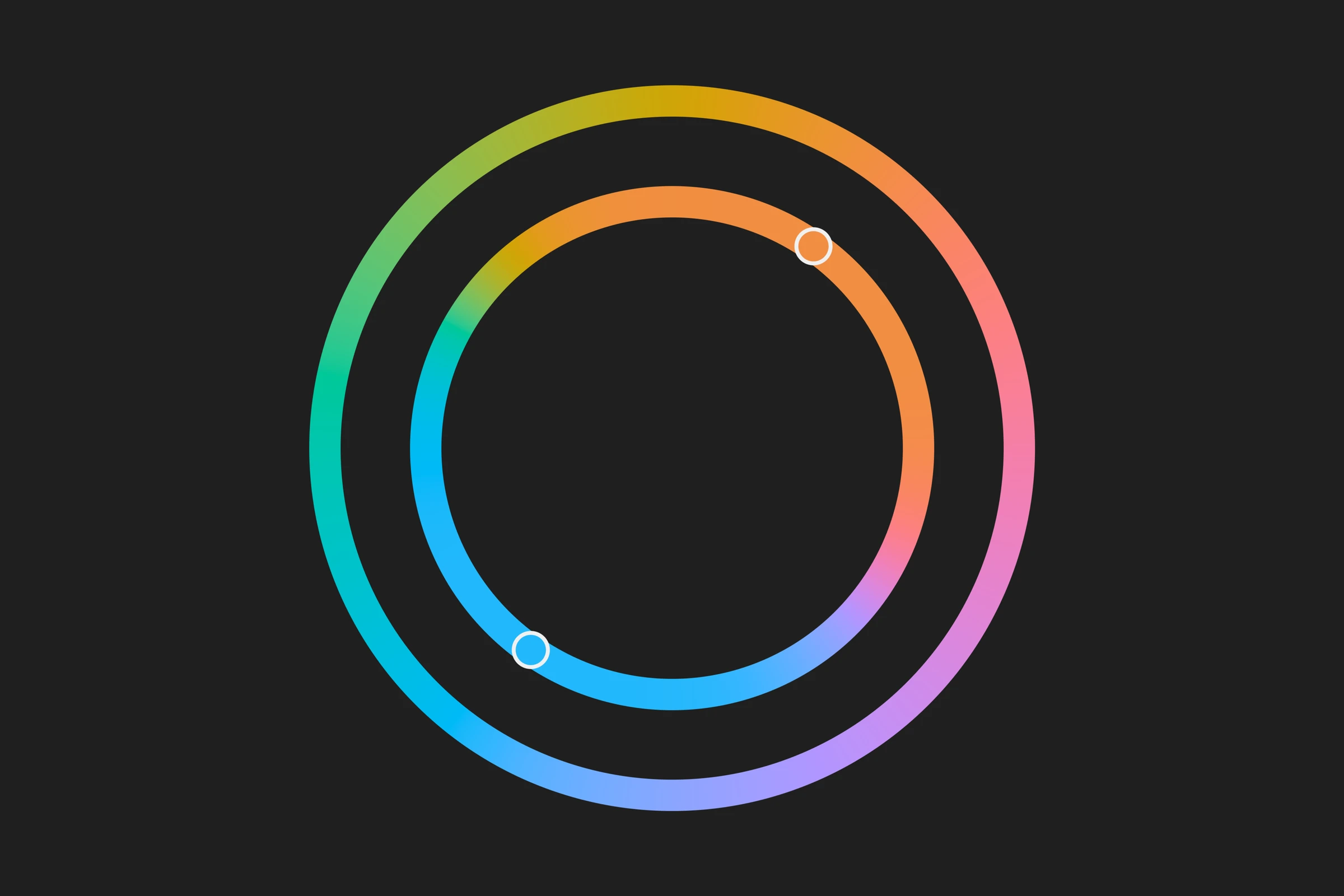
Harmonies are ways of choosing colors that work together, and they're easiest to understand on the color wheel:
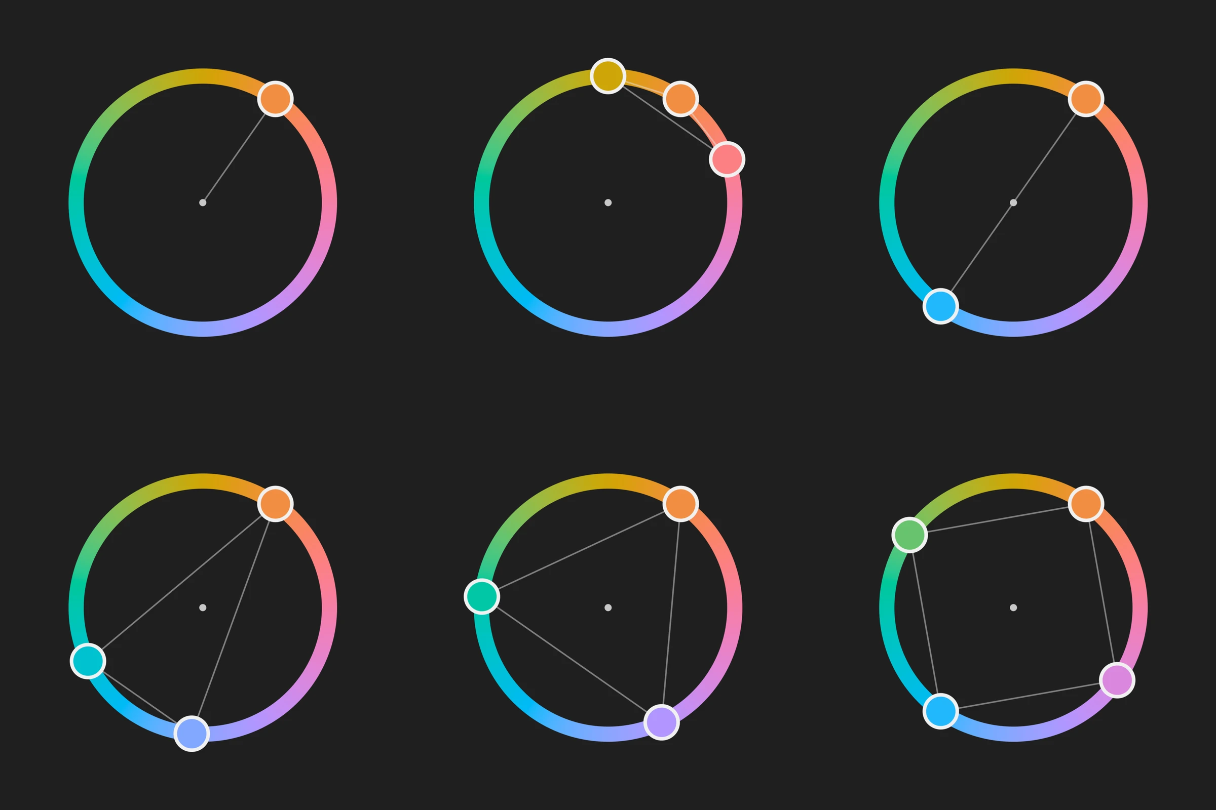
Left to right and top to bottom: single hue, analogous, complementary, split complementary, triad and tetrad, all on the same orange.
- Single hue. The whole photo in variations of one hue. It's the calmest, and the hardest to sustain without going flat.
- Analogous. Neighboring colors, like the oranges, yellows and reds of an evening. It feels natural and quiet.
- Complementary. Two opposite colors, the most contrast there is. The orange and teal of so many movies comes from here: skin leans orange, and its opposite, teal, sets it apart from the background.
- Split complementary. One color and the two neighbors of its opposite: contrast with less tension.
- Triad. Three colors at the same distance from each other. Lively, and hard to balance.
- Tetrad. Two pairs of opposites. Rich, but it needs one color to lead.
Whatever the harmony, it works best when one color dominates, another supports it and a third, in small amounts, acts as an accent.
Why Photisan has a color grading module
The color tools in photo programs were born to correct: balance the white, give a sky its saturation back, fix a skin tone. A film colorist's tools were born to shape: split shadows, midtones and highlights and tint them separately, isolate a color or a part of the frame, chain corrections one on top of another. We wanted to bring those tools to photography, with DaVinci Resolve as the reference, and put them where you develop the RAW file and work with layers, without going through another program.
And we added things designed for still photos. The most distinctive is harmony, which brings an idea from film production design to the photo.
What's in the module
Color grading opens below the photo, like the color page of a film studio, and lives in adjustment layers: each layer is a node, and the nodes apply one on top of another.
- Wheels. Lift, Gamma, Gain and Offset, to set and tint each part of the scale. Next to them, Contrast around a Pivot, which pulls shadows and highlights apart without moving middle gray; Saturation; and Density, which makes saturated colors deeper instead of brighter, as on film.
- Zones. Shadows, midtones and highlights split by exposure, with soft transitions and boundaries you move. Tinting a zone behaves like a filter in front of the lens, not like paint on top.
- Color curves. Hue versus hue, versus saturation and versus luminance; luminance versus saturation; and saturation versus saturation.
- Warper. A mesh over hue and saturation: drag a point to take one color to another, and nearby colors follow smoothly.
- Harmony. You choose a key color and a harmony, and the photo's colors gather into that palette. The order of the hues is kept, so no jumps appear, and grays don't move.
- Moods. Starting points by the feeling you want to convey, such as Epic, Nostalgia, Tension, Noir or Western, with thumbnails of your own photo.
- LUT. Import a .cube from Resolve, Premiere or your camera, which is applied first, and tune the look on top. You can also export your grade as a LUT.
- Qualifier and Windows. With the eyedropper you isolate a color to work on it alone; with windows, a part of the frame.
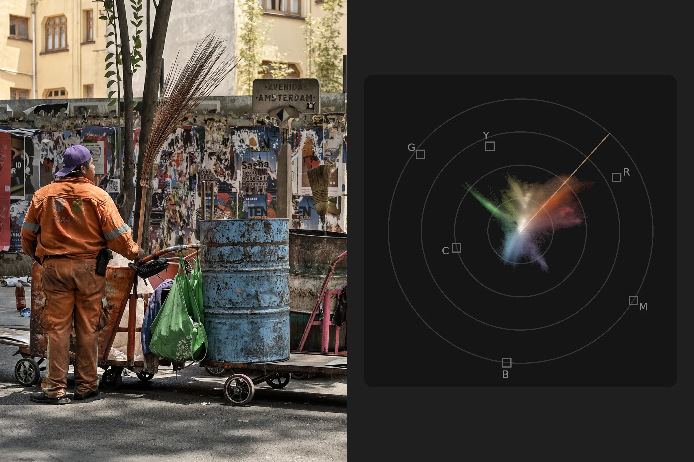
A vectorscope is always in view, showing each color by its hue and saturation, with the skin tone line and the harmony's palette marked.
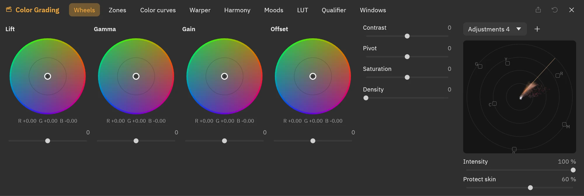
Color grading below the photo: the wheels, the module's tabs and, on the right, the vectorscope.
How to work with color grading
- First, a clean base. Set exposure, white balance and contrast in the development before grading. A look on top of a badly exposed photo multiplies the problem.
- Decide what it should feel like. Before you touch a wheel, give the photo a word. If you don't have one, open Moods and look at your photo with each: the thumbnail often tells you what you were after.
- One node per idea. One for overall contrast and balance, another for the look, another for local work. A new node is ⌥S (Alt+S on Windows and Linux). That way you can turn each idea off on its own, lower its Intensity or remove it without redoing the rest.
- Light before color. Contrast, pivot and each zone's exposure decide the shape of the image; tints come after. Tinting a photo with no shape doesn't fix it.
- Tint lightly. A classic that works: shadows a little toward cool and highlights a little toward warm. Small moves on the wheels go further than they seem.
- Look after skin. Turn on Protect skin when you move hues with the curves, the warper or the harmony, and check on the vectorscope that faces stay near the skin line.
- Trust the vectorscope more than your eyes. After a few minutes the eye gets used to a color cast and stops seeing it; the vectorscope doesn't. Rest your eyes now and then, and compare with the original by turning the node off.
- For a series, a LUT. When one photo has the look you want, export it as a LUT and import it into the others. Then adjust each with a node on top: the series shares a palette without every photo looking identical.
- If the grade shows before the photo does, it's too much. Lower the node's Intensity to the point where you'd miss it if you took it away.
What we keep to ourselves
How the harmony gathers colors without breaking the order of the hues, how the zones are split and how the whole grade is processed so it responds just as fast whatever it does are our recipe. The rest is the craft of film color, within reach of a photo.
If you don't have Photisan yet, download it and try it for free. Color grading is in the Color grading menu, or press ⌥⌘E (Ctrl+Alt+E on Windows and Linux).