 Photisan
The vectorscope: what it is and how to use it to edit color
Your eye gets used to a color cast; the vectorscope doesn't. What it shows, what it's for, how to read it in any program and how to use Photisan's while you grade.
The eye is very good at seeing color and very bad at measuring it. Look at a photo with a blue cast for a few minutes and it stops looking blue: the brain corrects it on its own. Add the screen, the room's light and tiredness. The vectorscope is an instrument that doesn't get used to anything, doesn't get tired and doesn't depend on your monitor. It was born with color television, so engineers could check the signal arrived right, and today it's in every serious video and color program. In Photisan it's in color grading, always in view.
What it shows
It's a circle, and every pixel of the photo is drawn on it as a dot according to its color. The angle is the hue: reds one way, blues another, all in the order of the color wheel. The distance from the center is the saturation: the farther out, the more intense the color. The center is gray, and white, black and every gray land there.
What it doesn't show is brightness. A white and a black take the same place, the center, so to know whether something is light or dark you need the histogram or a waveform monitor. The vectorscope only talks about color.
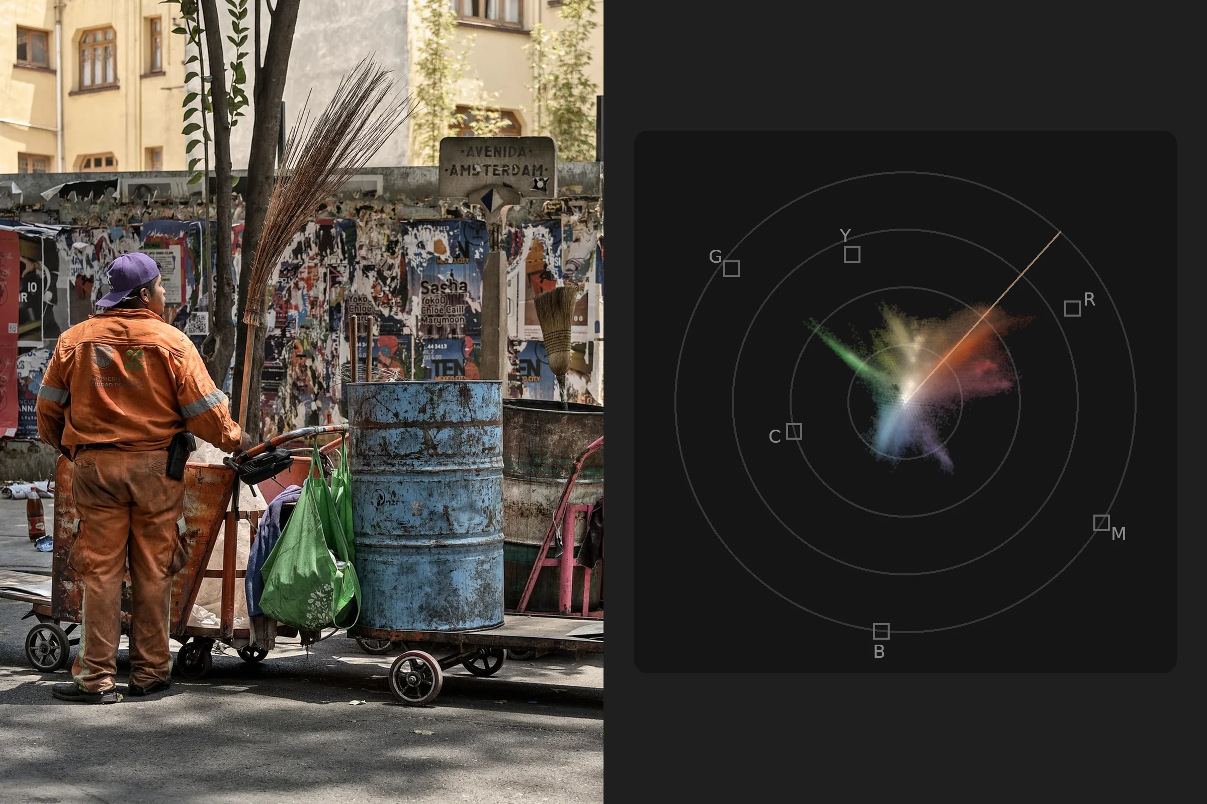
To help you find your way it has fixed marks. Six small boxes show where red, yellow, green, cyan, blue and magenta fall at 75% saturation, the reference of television color bars. Rings divide the distance from the center. And a line marks the hue of skin.
The cover shows a photo next to its vectorscope. The orange uniform makes the arm reaching toward the skin line, the drum the blue arm, and the bags the green one. The walls and the asphalt, nearly gray, stay close to the center.
What it's for
- Finding color casts. If a photo has an overall tint, the whole trace shifts toward that hue, even when your eye no longer sees it.
- Looking after skin. Skin has its own line, and telling whether a face has drifted toward magenta or green is easier there than in the photo.
- Knowing when you've overdone saturation. Dots far from the center, beyond the small boxes, are very intense colors.
- Seeing the photo's palette. The shape of the trace tells you which colors dominate and how they relate.
- Matching a series. Two photos with similar vectorscopes have similar color.
- Checking a black and white. If it's neutral, everything falls on one point at the center; if it's toned, the trace stretches toward the toner's hue.
The skin line
The skin of any person, light or dark, has almost the same hue. What changes from one person to another is mostly brightness and saturation, and the vectorscope doesn't show brightness. That's why skin falls near the same line, between red and yellow, whoever is in the portrait.
If the skin's arm drifts off the line toward magenta, the face looks pink or flushed; toward yellow and green, it looks sallow or ill. It's a reference, not a law: under a sunset or neon, skin really does change, and sometimes that's exactly what you want. The line tells you where you are; you decide whether it's right.
How to read the shapes
With practice, the shape of the trace reads at a glance. These are four vectorscopes of the same photo, changed on purpose to see how it responds:
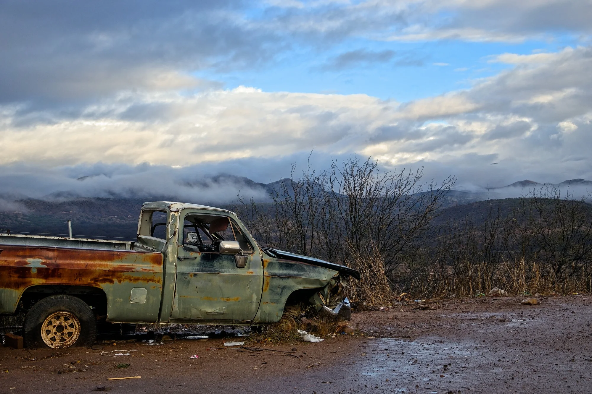
The photo of the four examples.
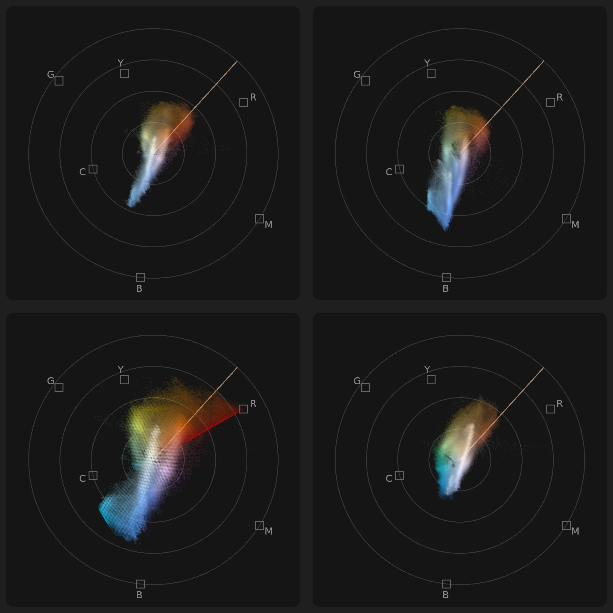
Top, the photo as it is, with the sky's blue arm and the rust's orange one, and the same photo with a cool cast: the trace leans toward blue and that arm grows. Bottom, with saturation overdone, the arms get longer and the red hits the edge of what the screen can show; with teal shadows and orange highlights, the trace stretches between those two hues.
- A small, centered trace is a photo with little color: an overcast day, a neutral interior.
- The whole trace shifted to one side is a cast in that direction.
- Long arms coming out of the center are intense colors; past the small boxes, a lot of saturation.
- Two opposite arms are a complementary palette, like orange and teal.
- A narrow wedge is an analogous palette: neighboring colors.
- A straight cut at the edge is colors that reached the limit of what can be shown and got flattened there.
Step by step, in any program
Every program draws the vectorscope its own way. In classic video scopes, red sits at the upper left and the skin line points toward eleven o'clock; in others, Photisan included, the colors turn to another position. First of all, find the small boxes and the skin line. Everything else works the same everywhere.
- Look before you touch. Note where the trace is and what shape it has. It's your starting point, and it will tell you what each adjustment changed.
- Neutralize first. Find something that should be gray or white: a wall, a white shirt, the asphalt. Those areas make up the part of the trace closest to the center. If that part is shifted toward a hue, correct the white balance or the global wheel the other way until it's back in the center. If your program can measure just one area of the photo, use that.
- Check the skin. Make sure its arm sits on the line or very close to it. If the face is small in the frame, it can get lost among the rest: then judge it by eye too.
- Shape the color on purpose. With a neutral base, apply the look you're after and watch how the trace moves: a warm look pushes all of it toward orange; splitting cool shadows from warm highlights stretches it along that axis.
- Watch the extremes. Look at the dots farthest from the center. If they go past the small boxes, make sure they aren't skin or something important, and lower the saturation of only the most intense colors rather than the whole photo.
- Compare to match. For two photos to look like the same series, compare their vectorscopes: same position and a similar shape means similar color.
- Decide with your eye. The vectorscope tells you where the colors are, not where they should be. If the photo should be warm, the trace doesn't have to be centered.
Photisan's vectorscope
It's in the color grading panel, which opens below the photo from the Color grading menu or with ⌥⌘E (Ctrl+Alt+E on Windows and Linux). It takes the right side of the panel and stays in view whichever tab you're working in; if you make the panel very short, it shrinks and, once it no longer fits, it hides.
- What it measures. The photo as you see it, with all its layers, not just the node you're editing. While you drag a control it updates several times a second, and when you let go it catches up.
- How it draws. Each dot takes the color of what it stands for, and glows brighter where more of the photo has that color. Colors are placed in a space designed around vision, so the same distance from the center looks equally saturated in any hue.
- Where each color sits. Red on the right, yellow at the top, green at the upper left, cyan on the left, blue at the bottom and magenta at the lower right. The grading wheels follow the same general layout, with red on the right, green at the upper left and blue at the lower left.
- Its lines. The skin line, peach colored, always. And when a harmony is on, amber lines with the hues of its palette.
How to use it while grading in Photisan
- Open color grading and look. Before moving anything, study the trace. If the photo comes from a RAW file with a good white balance, the neutral parts should already be near the center.
- Fix a cast with Offset. Push the wheel away from where the central part of the trace went, little by little, until it's back in the center. The vectorscope doesn't say whether the cast is in the shadows or the highlights: if Offset doesn't settle it, try Lift or Gain, or the matching zone, and see which one centers the trace.
- Protect skin before moving hues. With the color curves, the warper or the harmony, turn on Protect skin and check that the skin's arm stays on the peach line.
- Control saturation where it's needed. If dots go past the small boxes, instead of lowering Saturation for everything, use the Sat › sat curve to calm only the most intense colors, or Lum › sat to take color out of shadows that look dirty.
- Build the palette with harmony. Choose a harmony and its key color, and watch the amber lines: they're the hues the colors will go to. Raise Strength until the trace's arms come close to them without the photo looking forced. You can also drag on the harmony's wheel to turn the palette.
- Use the qualifier with an eye on the arm. If one particular color is out of place, pick it with the Qualifier's eyedropper and correct it alone: only its arm will move.
- Match a series across tabs. The vectorscope shows the active photo. With the photos open in tabs, switch between them and compare the shapes; once they look alike, export the grade as a LUT and apply it to the rest.
- Compare with the original. Turn the node off and on: the photo and the vectorscope change together, and you see at once how far you moved the color.
Over time something curious happens: you start glancing at the vectorscope the way you glance at the camera's light meter, and seeing photos a little the way it sees them.
If you don't have Photisan yet, download it and try it for free.